From prawns to prosecco, product packaging is crucial if you want to make sales. The right packaging captures consumer attention, communicates the essence of your product and inspires purchases. Here are ten ideas to kindle your creative furnace for packaging that leaps off the shelf and works harder for your products.Lamb and mutton and the packaging predicament…
No pressure, but your packaging has to be memorable.
Busy consumers in busy shops and busy homes are bombarded with sensorial stimuli. They make decisions quickly. And often ruthlessly. Sure, you can cut costs by scrimping on package design. But to the consumer, sloppy packaging suggests a sloppy product. Lamb dressed as mutton just looks like mutton.
So if the quality of your product alone won’t close the deal with new customers, what will? Well, your packaging has to reflect the care you pour into making your product in the first place. And sometimes you only have seconds to grab attention and make the right impression.
The good news is that consumers notice imaginative packaging. They appreciate thoughtful design. And once your packaging has piqued their interest, you are just one small step from making a sale.
Here are ten ideas for breathing fresh life into your product packaging design.

1. Focus on a specific end-user
Today’s print technology is sophisticated. It’s possible to create packaging that was unimaginable even a few decades ago. This choice and flexibility can be crippling. Yet the fundamental tenets of design still apply. Focusing on the connection between your product and your audience will give you a fine starting point in your bid to create packaging that works more effectively for your business.
2. Get creative with colour
Bold splashes of colour and unexpected palettes can quickly elevate packaging from mundane to mesmerising. Dare to be different. Life is polychromatic.
3. Go minimal
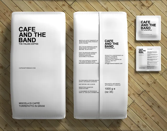
Minimalism is à la mode. Packaging designers are nixing the noise to help busy consumers understand immediately what product they are looking at. Less clutter, more clarity. Consumers don’t have time to figure out what you are trying to sell them. They want their needs met. Fast.

The modern minimal aesthetic leans on copy to do the heavy lifting: removing graphical elements to leave bold, clear messages rendered in simple typefaces. As for non-linguistic elements, think block colours, two-tone and lots of negative space. Clarity has become an art form.
4. Vintage packaging: in with the old
An extension of the push for simplicity is to go retro. Imitating the vintage packaging of the 1920s summons the spirit of a simpler, quieter time – and draws an arresting contrast to the glossy packaging that’s more typical of the shop shelf.

Calligraphy, letterpress and foiling can be used to make the mass-produced feel more authentic, modest and artisanal. That’s crucial in an age when consumers are sometimes sceptical of global brands.
>> Vintage packaging: in with the old, out with the new?
5. Your product is your packaging
What if your product was actually part of the packaging? Modern die cutting techniques allow designers to showcase products in wonderfully evocative ways – such as this hair-raisingly good pasta packaging. It’s cunningly creative, it leaps off the shelf and it shows consumers exactly what they’re getting.
6. Eccentric geometrics
Geometric patterns are incredibly eye-catching and add a touch of quality to product packaging. Combine that with imaginative uses of colour (see point two) for products that jump off the shelf.
7. Break new creative ground with textured labelling
The avant-garde plaything of premium manufacturers is textured labelling – a unique printing technique that brings depth and personality to labels. Perfect for premier potations and luxury cosmetics, textured labelling allows you to experiment with label-raising for multi-sensory packaging that feels as good as it looks.
>> Premium packaging and the benefits of textured labelling

8. Experiment with materials
These days it’s possible to print and code onto any packaging substrate. That allows you to experiment with packaging materials that break the mould and differentiate you from the competition.

9. Become a shapeshifter
Function first, form second. A raft of packaging innovations – such as foil pouches and resealable plastic wrappers – mean designers have never had it so good in their quest to provide consumer convenience. Reinventing the way your product is packaged could transform your market share.
10. Change it up!
Why limit yourself by sticking slavishly with one design? The sophistication of today’s digitised, variable printing technology means short, flexible print runs no longer mean compromising efficiency. Change your designs with the seasons. Riff on major events such as Wimbledon or Valentine’s Day. Or experiment with personalised packaging.
>> Personalised packaging: Coca-Cola did it, you can too
Over to you…
Design trends come and go. That’s how it will always be. But the variety of packaging and printing technology available means that designers have never had so much freedom to create vivid packaging that bolsters brand reputation, entices customers and encourages sales. Go play.