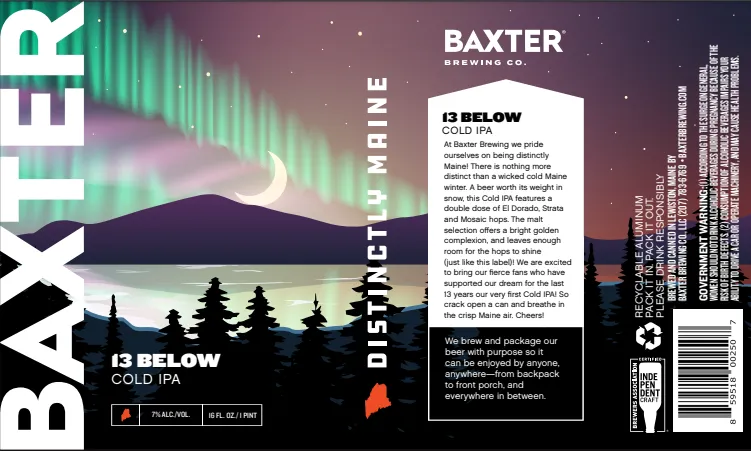
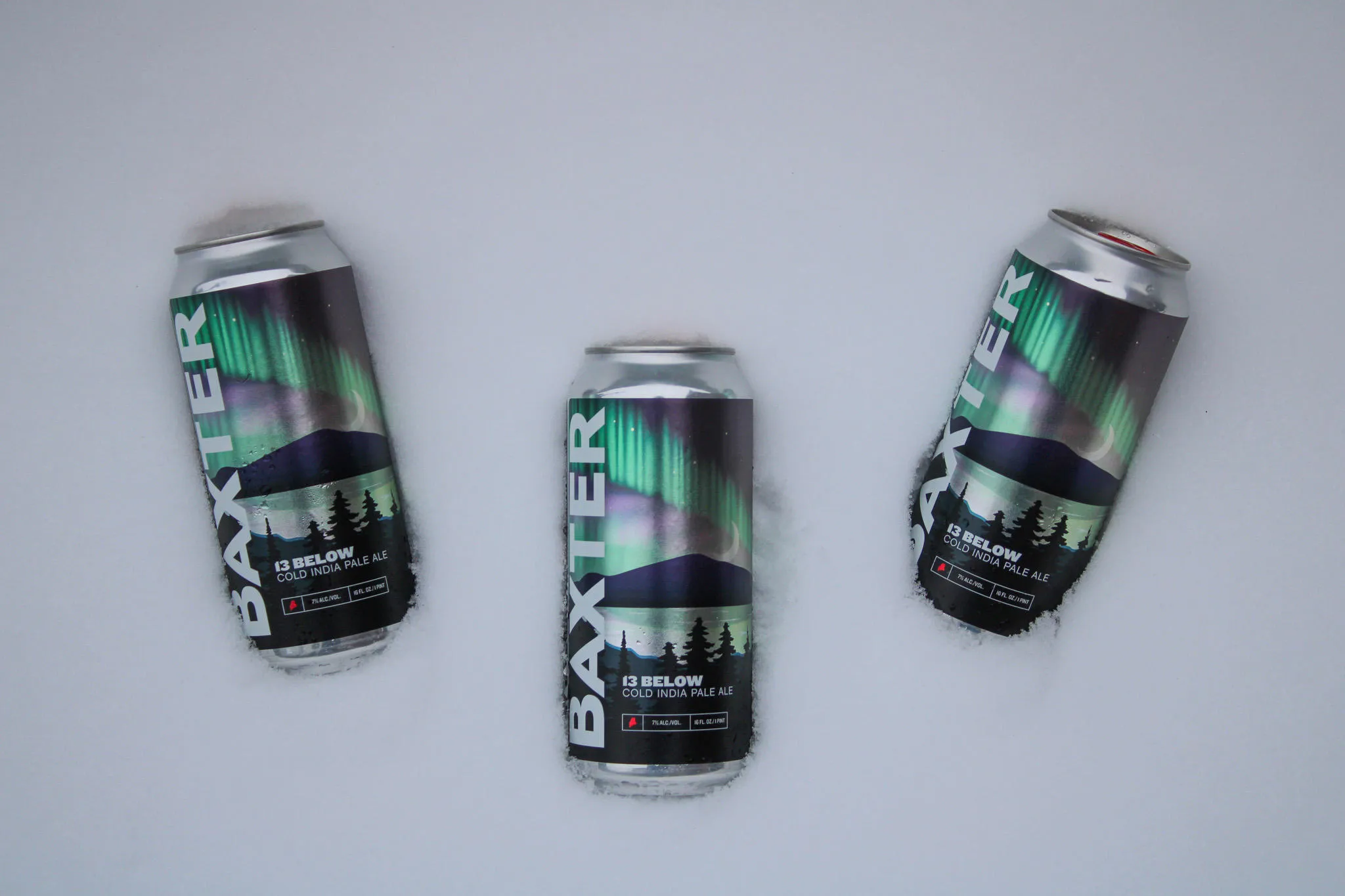
Amherst Label, an Inovar company, was recently recognised with multiple awards in the 47th Annual TLMI Printing Excellence Awards. The company’s award-winning labels include Baxter Brewing Co.’s ‘13 Below’ Cold IPA beer can label – printed on an MPS-Domino hybrid press, one of Amherst’s three Domino presses – which was voted ‘best-in-class’ in the alcoholic beverage category.
The TLMI judges praised the look and feel of the label, highlighting the high contrast of the high-opacity white print against the metallised film, as well as the tactile, 3D feel provided by the label’s rough textured matte UV varnish, which creates a sandpaper-like coating.
Emma Barry, Global Product Marketing Manager – Digital Colour at Domino, caught up with Shane Beaton, Account Executive at Amherst Label (centre right), and Devin Smith, Sales Marketing Manager at Baxter Brewing Co. (centre left), to discover how the award-winning label was brought to life.

How long have Amherst Label and Baxter been working together?
DS: We started working together two years ago when we were looking for a new printer for our short-run labels. Amherst now pretty much prints all the labels for our limited-release beers, including Window Seat, Lady Sasquatch, Yeti Sasquatch, and Coastal Storm, to name but a few. Anything that’s in a 16oz can, as well as a few seasonal runs for 12oz cans.
SB: Between the 12 and 16oz beer can labels we manage for Baxter, we’re looking at more than half a million labels annually.
We support the Maine Brewers’ Guild, an organisation that oversees all the breweries in Maine, which helps us to connect with lots of different breweries. We probably work with 80% of the breweries in the state of Maine. The craft brewers, like Baxter, are all great people and fun to work with. We work together and develop ideas – like we did with the label that won the award.
How did you come up with the label design?
DS: We try to stay true to our brand and our brand style. Every label features the Katahdin mountain ridgeline to honour our namesake from Baxter State Park. Baxter written in large text up the left side is our way for the consumer to recognize our product and being able to explore more within our portfolio.
For our 13th anniversary ’13 Below’ Cold IPA, I was thinking of the sky on a cold winter night. Someone suggested including the Northern Lights, which was a perfect idea. Adding the Northern Lights above the ridgeline and tree silhouettes into the foreground, it all came together.

What did it take to bring your design to life?
DS: We all wanted the Northern Lights to pop, so once I finished designing the label, I had to figure out how to make it really stand out.
Shane shipped over some samples with different effects that they had used on the Domino in the past, and we brainstormed together. That’s how we decided on the reflective metallised film.
This label turned out way better than I could have imagined, that’s for sure. The reflective film, the printed gradient and the tactile coating that we add to all labels – it all worked well together.
SB: The matte UV textured varnish definitely enhances the way the label feels. It also helps when applying the labels to the cans in their high-speed canning line. It runs a lot smoother than other finishes, ensuring the labels are applied securely.
You mentioned this is a limited release; how many labels are we talking about?
SB: In the grand scheme of things, it was a small run, a little smaller than some of the other runs we’ve done for Baxter. It was 7,000 labels, and they paired it up with 3,000 labels for another SKU, making the total run 10,000 labels. It’s a 5x8” label, and we ran it two across, which came out to about 4,500 feet, running roughly around 97 feet per minute.
Why did you choose to print the labels digitally?
SB: We have three Domino N610i presses, two hybrids and one roll-to-roll press, which means we can offer a range of different printing services depending on our customers’ needs. We use them for the majority of our craft beer labels, including Baxter’s.
Although much of our growth in recent years has been driven by our digital capabilities, it’s important for us and for our customers to have access to both digital and flexo technologies. Every scenario is different, and flexo has its place.
For the label in question, it would have been possible to produce the design on one of our flexo presses, but as we were producing a small run of labels, this would have worked out more expensive, considering the setup and cost of creating plates for every colour.
The judges’ comments highlighted the quality of the white text featured on the label. Did you use the double white bars for that, Shane?
SB: Yes, we did use the double white for that.
One thing that attracted us to Domino originally was how opaque your white inks are. There are a lot of other brands out there where the white isn’t as opaque.
We were able to make those whites appear on the metallised film with a similar look and contrast to knocking out the text on a white substrate.
Devin also incorporated different gradients and screens of white into the label design, and the high opacity helped make those gradients more defined.
DS: So true. There are a lot of different gradients of white on the label, like the ice and water reflection below the moon. I wasn’t sure what the reflection in the design would look like on the metallised film, so we did a hard copy proof to check, and it worked well.
What role did the extended colour gamut of the N610i play?
SB: Having the additional colour capabilities, the orange and the violet, definitely helps with projects like this. Having the luxury of running that extended gamut over standard CMYK enabled us to hit the neon green of the Northern Lights much more accurately. Greens can be hard to get right.

Those colours certainly catch the eye. Have you tried taking your label designs a step further and adding interactive features like QR codes to enhance consumer engagement?
DS: We’re putting QR codes on a decent number of labels. We just did one for an upcoming boxing event, which has a QR code that goes right to their website.
We try to use them to our advantage. We’ve teamed up with local skate parks in the past, trying to get as creative with them as possible. QR codes are honestly a lifesaver.
We have also experimented with other interactive features; for example, we teamed up with a local ski resort for a reggae festival and used a peel-off sticker that was always a huge hit. The label design had a reggae lion on the ridgeline, and people could peel it off and stick it onto their ski gear. Whenever I go skiing in Maine, I always see one. They’re on skis, ski helmets, water bottles – it’s a great marketing tool.
SB: That one was produced on a Domino N610i, printed on a dual-level material. The reggae lion in the label design was on a secondary sticker.
It’s the kind of marketing that lives on. The UV inks help maintain that durability. All our Domino presses run UV inks, and they do really well out in the weather and the sun.
Thank you, Shane and Devin; I appreciate you taking the time to talk to me today.
For more information about Amherst Label, please visit www.amherstlabel.com.
See Baxter Brewing Co.’s creative beer can label designs and learn more about their latest beers at www.baxterbrewing.com.
Learn more about the Domino N610i digital colour label press and N610i digital hybrid integration module – a great choice for beer can label printing.